UX/UI · Product Design . Consumer · E-commerce · Apr – Dec 2019 (9 Mos)
Alendor — Launching a Luxury Fragrance Line, Digitally
Designed a discovery-led shopping experience that helps customers explore, compare, and choose fragrances with confidence.
Impact: Making a complex product category easier to explore and understand.
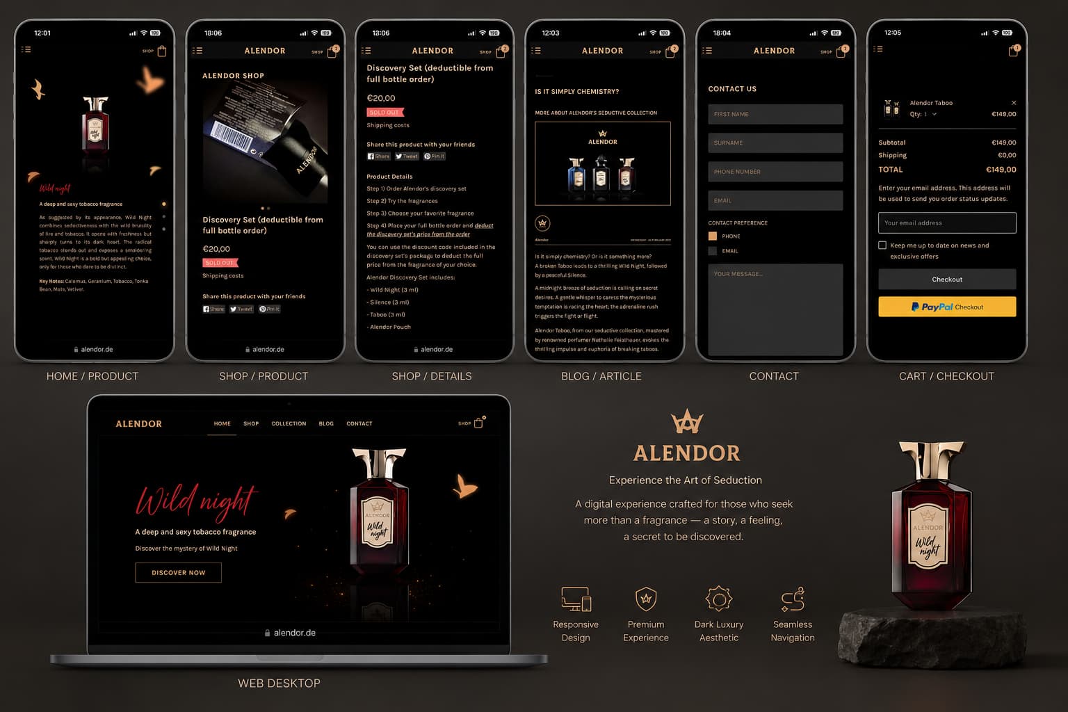
“Screens shown reflect the original 2019 design. The live site has since been redesigned by others.”
As designer for Alendor’s new fragrance line, I led the end-to-end design of the digital product experience for the launch of three premium perfumes. My responsibility spanned UX strategy, interface design, visual direction, and close collaboration with the development team over a six-month period.
The goal was to translate Alendor’s brand DNA — combining German design precision with French mastery of perfume creation — into a smooth, modern, and luxurious digital experience.
Alendor was launching three premium fragrances with no digital presence. The challenge: translate a luxury physical brand — rooted in German precision and French craftsmanship — into a digital shopping experience that felt equally premium.
01
Overview
I was responsible for the UI/UX design of a fragrance e-commerce website, focusing on a smooth shopping flow and a visually rich product experience — leading the end-to-end design of Alendor’s digital fragrance experience, from UX strategy and interface design to visual direction and developer handoff.
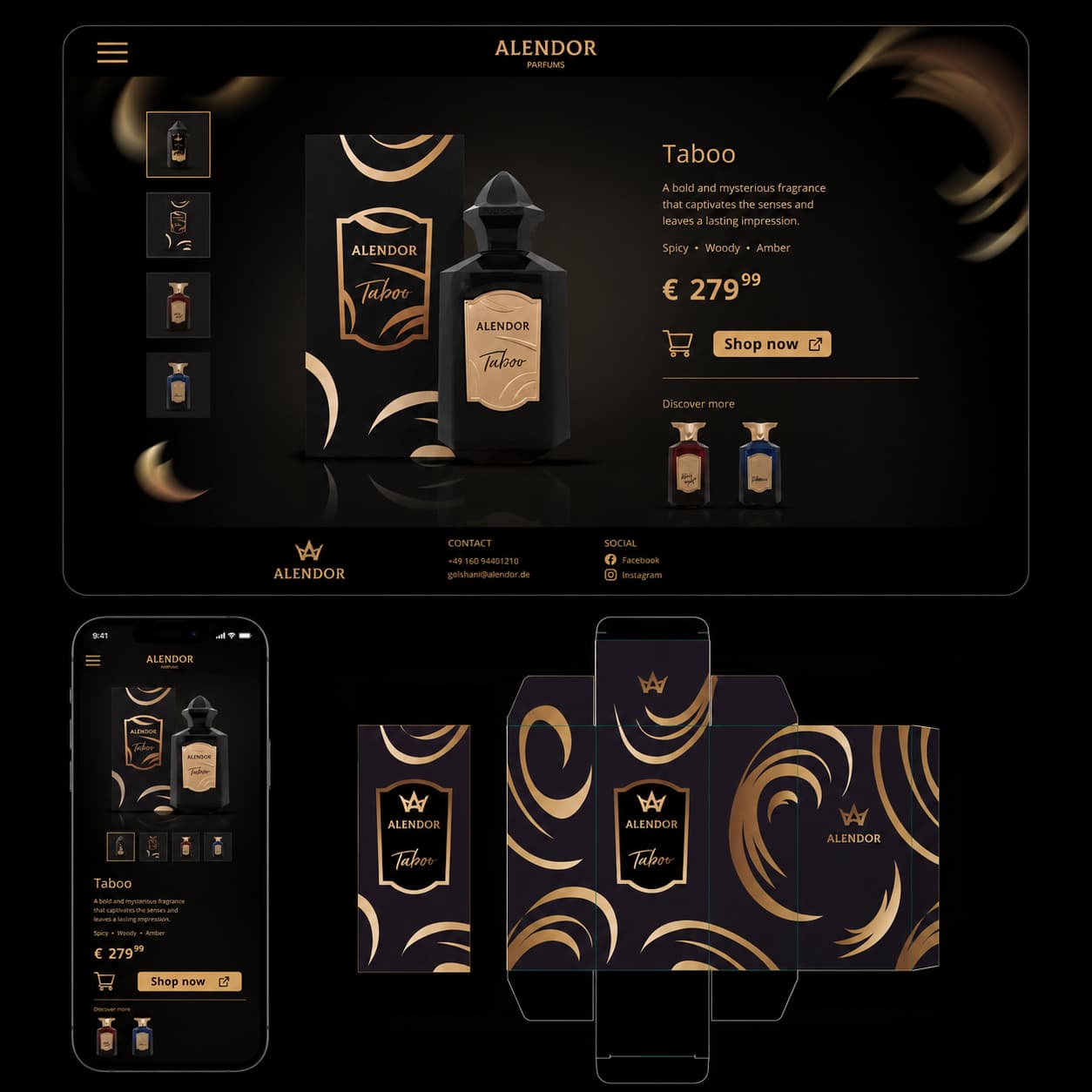
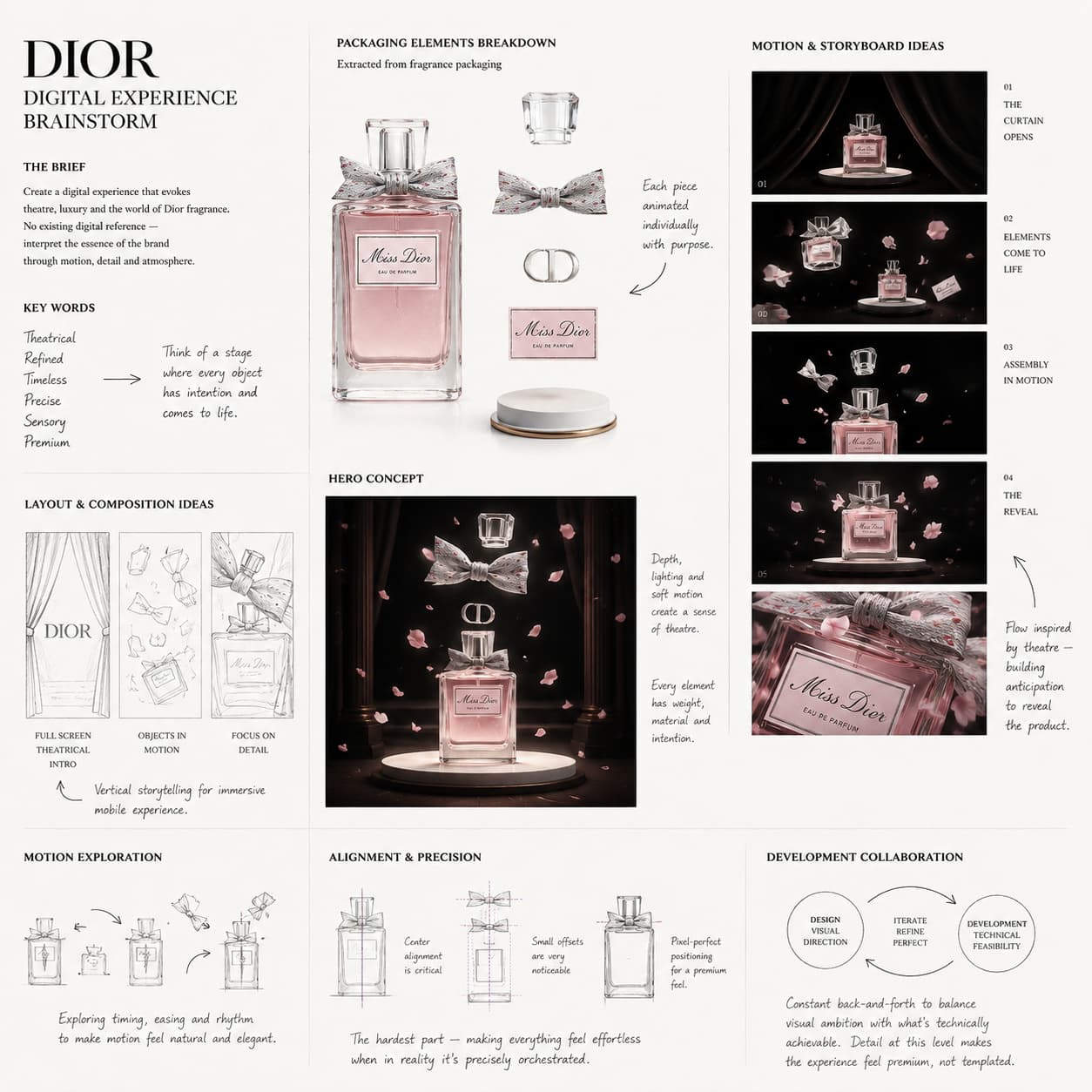
I translated the brand’s identity — rooted in German design precision and French perfume craftsmanship — into a modern, premium, and intuitive product experience. Inspired by Dior’s timeless aesthetic, I designed a cohesive system that balanced brand consistency with a distinct identity for each fragrance.
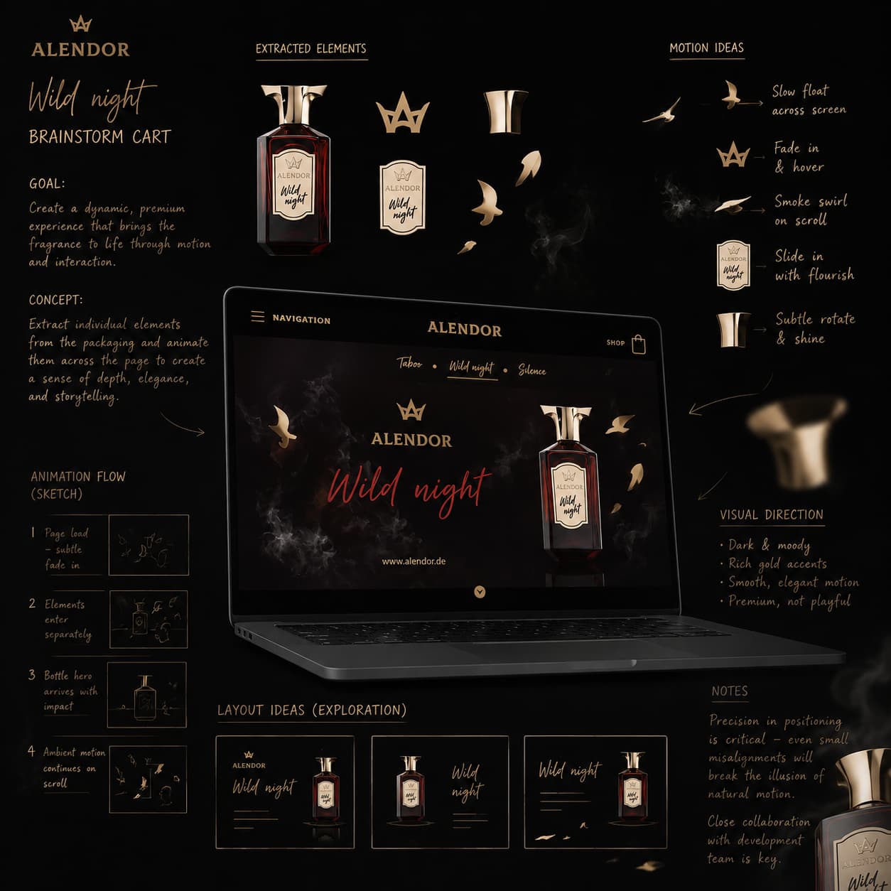
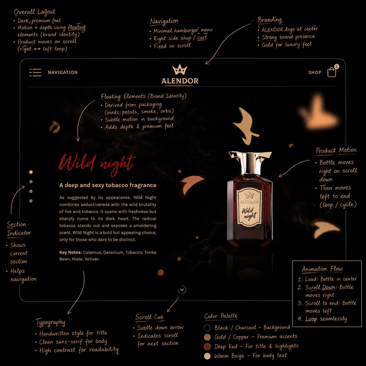
My work involved creating customized product pages based on packaging elements, developing a bespoke typographic system, and defining clear user flows that emphasized product storytelling, clarity, and usability. I designed mobile-first experiences with clean navigation, clear CTAs, refined micro-interactions, and editorial use of whitespace.
I collaborated closely with the development team throughout, delivering interactive prototypes, detailed specifications, and a scalable UI system to ensure a high-quality, production-ready implementation.
02
My Role
Step 01 — Understanding the Product & Users
Understanding the Product & Users
I started by understanding the fragrance products, brand positioning, and how users typically shop for perfumes online — focusing on how users explore scents, compare products, and build trust before purchasing.
Step 02 — User Flow & Information Architecture
User Flow & Information Architecture
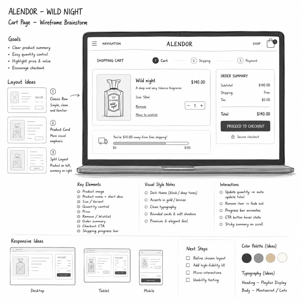
I designed clear user flows from the homepage to product selection and checkout, aiming to reduce friction and create a smooth shopping experience.
Step 03 — Visual & UI Design
Visual & UI Design
The interface was designed to reflect a premium and emotional brand feel. Color, typography, and imagery were used to communicate the personality of each fragrance while maintaining visual consistency across the website.
Step 04 — UX Refinement
UX Refinement
The design was refined by improving clarity, simplifying the purchase journey, and highlighting key product information and calls to action.
03
Process
04
A Signature Detail
05
Outcome
The brief was intentionally open-ended — evoke the feeling of a brand like Dior — with no existing digital presence or reference to build from. Translating that feeling into concrete design decisions, then coordinating closely with developers to bring packaging elements to life in motion, required constant back-and-forth between visual ambition and technical feasibility.
The biggest challenge was balancing brand consistency with three distinct fragrance identities — in hindsight, I’d push for a shared component library earlier in the process, rather than designing each product page more independently before unifying the system.
Working from an open-ended brief — “make it feel like Dior” — with no existing digital presence to anchor against meant most early decisions were subjective calls I had to defend, not derive from data. In hindsight, I’d build a shared component library before designing the three fragrance pages independently; unifying them after the fact took longer than building shared foundations up front would have.